solution
Moving from an e-commerce website,to an engaged hub that supports their artists!
A hub for female and queer artists
Our solution centers on a narrative-driven UI, prioritizing artist advocacy and the strategic amplification of Patroa Studio’s mission.
Enhanced Artist Visibility
A core component of the redesign is the dedicated Artist Page, designed to to foster a deeper connection between the creator and the consumer. By spotlighting the artist’s journey and creative philosophy, we transform a transactional interaction into a narrative-driven experience.”
- Biographical Narrative
Establishing a personal connection through the artist’s story.
- Dynamic Portfolio Reel
A focused showcase of the artist’s specific collection to streamline the browsing experience.
- Multimedia Integration: A personal video feature to heighten authenticity and brand trust.
Moving from an e-commerce website, to an hub that supports their artists
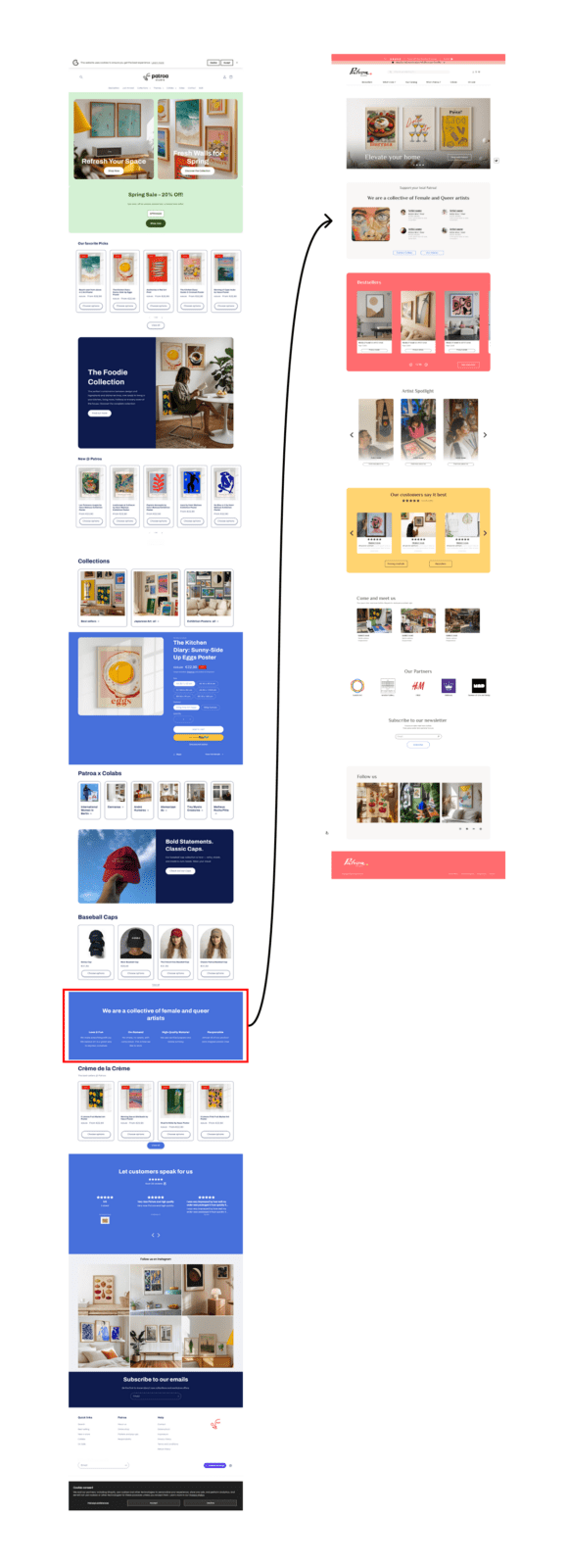
Problem: In the live version, the engagement and values section was buried deep within the page, requiring significant scrolling and risking user drop-off.
- Solution: The section was re-prioritized and moved directly below the Hero section. This ensures that the brand’s mission is established early in the user journey, increasing the likelihood of conversion through value-alignment.
Prioritized Collabs: Humanized the e-commerce experience by featuring engaged artists prominently.
- Mission-Driven Conversion: Integrated brand identity directly into the user flow to ensure the social mission acts as a primary driver for sales.
Building the solution
Competitor analysis
- Main Competition
- SWOT
- Competition mapping
Main competition
As identified by the stakeholder
Main competition
Analysis
JUNIQE represents the “Industrialized Art Marketplace.” It wins through scale, automated fulfillment, and broad accessibility.
Unique Value Proposition / Advantages
Diverse Marketplace: Scalable business model featuring a high volume of varied artists.
Strategic Partnerships: Leveraging big-brand collaborations to drive market reach.
Industrial Scale: Focus on mass production and high-efficiency distribution.
Disadvantages
Navigation: Deep category structures with inconsistent “back” functionality and frequent dead ends.
Brand Identity: High-volume commercial layout with a focus on transactional discounting rather than artistic curation.
Interface Accessibility: Language and location settings are restricted to the footer.
Main competition
Analysis
PSTR Studio operates as an “online emporium” that focuses on unique vintage works and contemporary exhibition prints.
Unique Value Proposition / Advantages
- Curation & Discovery: Extensive expert suggestions and curated collections supported by “Inspiration Artwalls.”
- Artist-Centricity: Dedicated artist profiles and video introductions to humanize the creators.
- User Experience: Intuitive navigation system with robust filtering options.
Disadvantages
- Visual Hierarchy: Monotonous layout with uniform section sizing, relying solely on background color shifts for distinction.
- Navigation & Scroll: Excessive homepage length requiring prolonged scrolling to access lower-level content.
- Brand Sentiment: Corporate-leaning aesthetic that lacks a personalized, boutique feel.
Main competition
Analysis
The Dybdahl Co. is a heritage studio that restores and reimagines illustrations from museum archives for modern interiors.
Unique Value Proposition / Advantages
- Established Authority: Leverages a decade of industry experience to build brand authenticity and trust.
- Niche Specialization: Focuses on a distinct market segment.
- Minimalist & Immersive UI: Features a sober, scientific-themed aesthetic with a high-impact hero section and large-scale product imagery.
Disadvantages
- Conversion Friction: A notable absence of prominent visual Calls to Action (CTAs).
- Layout Instability: Variable hero height causes inconsistent content shifting during window resizing.
- Limited Versatility: Specialized aesthetic and repetitive style may restrict appeal to a narrow audience.
SWOT
Strengths
- Niche Specialization: Focused market positioning to maximize brand authority.
- Entrepreneurial Narrative: Authentic self-made story to build consumer trust.
- Localized Production: Ensuring high quality control and community support.
- Artist Partnerships: A collaborative ecosystem for independent creators.
Weaknesses
- Production Scalability: Limited output capacity due to small-scale operations.
- Conversion Optimization: Homepage lacks high-impact engagement triggers.
- Narrative Depth: Underutilized brand storytelling and mission potential.
- Digital Discoverability: Low search engine visibility and niche-market reach.
Opportunities
- Narrative Edge: Leverage deep storytelling.
- Artist spotlights: Humanize and highlight female and queer creators.
- Mission-Driven UI: Align architecture with core values and advocacy.
- Community Integration: Bridge digital and physical presence via street events.
Threats
- Market Saturation: Intense competition within the crowded global art print sector.
- Scalability: Operational risk of solopreneur burnout during rapid growth.
- Resource Gaps: Lack of a support team to manage complex business tasks.
- Price Competition: Market-wide pricing pressure from mass-production giants.
Competition mapping
This project leverages UX/UI design to evolve Patroa Studio from a localized brand into a premium, mission-driven boutique.
By integrating the studio’s advocacy and storytelling directly into the user journey, the redesign bridges the gap between independent artistry and high-end commerce.

User interviews
- 4 interviews
- Online shoppers, Artists
- Age range : 25-50
Key insights
While mass-market e-commerce platforms rely on quick transactions and minimal text, art buyers on Patroa Studio experience immediate friction because the platform treats its inventory like generic commodities. To convert visitors into buyers, the digital experience must evolve across three shared pillars:
The Demand for Tactile and Spatial Reassurance
Across the board, metric dimensions (29.7cm x 42cm) fail the user. Users cannot visualize how the art scales in a room. Furthermore, there is critical friction regarding what actually arrives in the mail, a user expressed confusion over whether a canvas is rolled or stretched on a chassis, while another mentioned the fear of flimsy packaging creasing the paper.
Humanizing the Supply Chain
Whether users are motivated by social advocacy or fine-art technical mastery, they all demand to know the story behind the print. They want an explicit, easily discoverable narrative detailing who the artists are, who is running the studio, where it is located, and how the physical printing process works.
Information Architecture Disorientation
The live website’s current navigation creates unnecessary cognitive load. Ambiguous, overlapping menu titles (like “Themes” vs. “Collections”) and confusing copywriting (like labeling a discount section “Sales”) actively hinder the discovery process, causing users to get lost or assume the site lacks content.
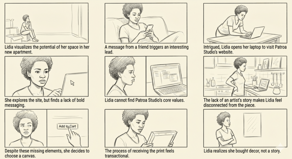
Meet Lidia (36, France): An independent event producer who recently moved into her own apartment. A passionate art and decor enthusiast, she curates a collection of local and travel-acquired pieces. Lidia is actively seeking unique prints to complement her space, prioritizing accessible art from businesses that align with her personal values.
Lidia K.
“I support businesses I believe in”
Goals
- Support community and professionals, not corporations
- Find new and exciting artists
- To expand her community and share artists and business
Pain points
- It is difficult to find art representative of her beliefs
- She can’t find businesses that align with her values.
- Her home is too empty and needs some to reflect her personality more.
Lidia K.
“I support businesses I believe in”
Goals
- Support community and professionals, not corporations
- Find new and exciting artists
- To expand her community and share artists and business
Pain points
- It is difficult to find art representative of her beliefs
- She can’t find businesses that align with her values.
- Her home is too empty and needs some to reflect her personality more.
ideation
With the problem statement clearly defined, the transition to ideation required a systematic approach to feature set development.
How Might We
reassure visitors of Patroa Studio’s quality work?
How Might We
highlight the story behind Patroa Studio and artists, businesses to the mindful activist consumer?
How Might We
help visitors identify themselves with Patroa Studio?
Design
- Wireframes
- Brand chart
- UX Enhancement &
Core Features
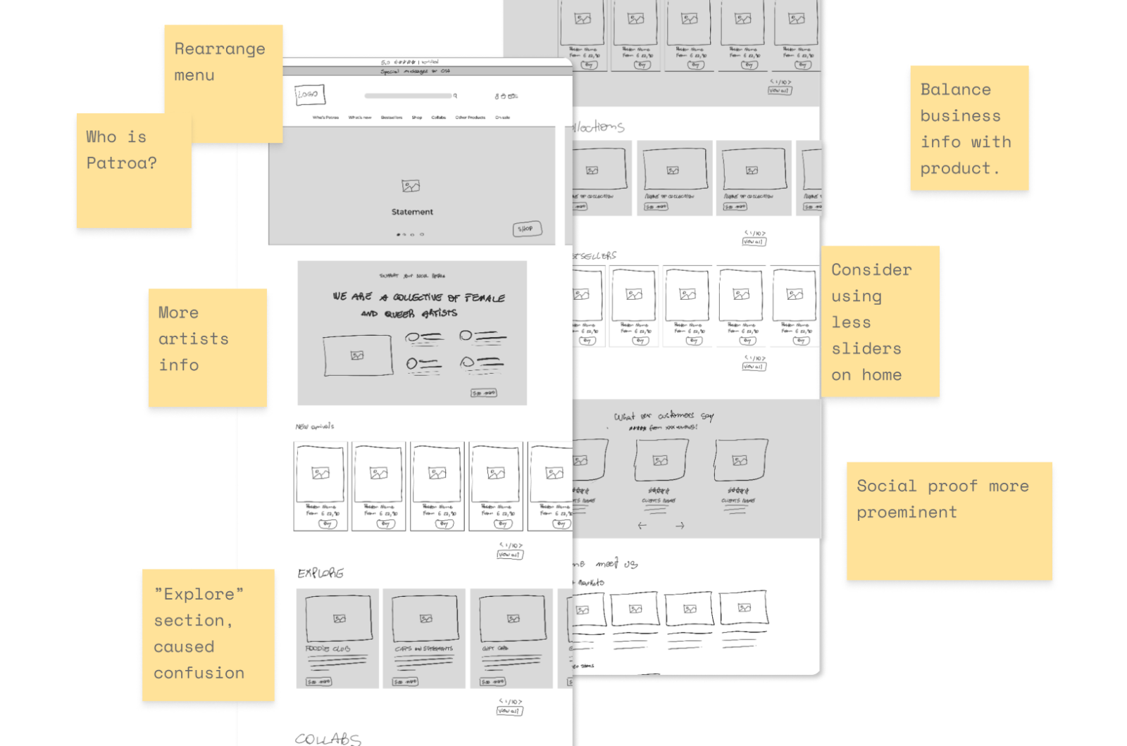
Low-fidelity wireframes
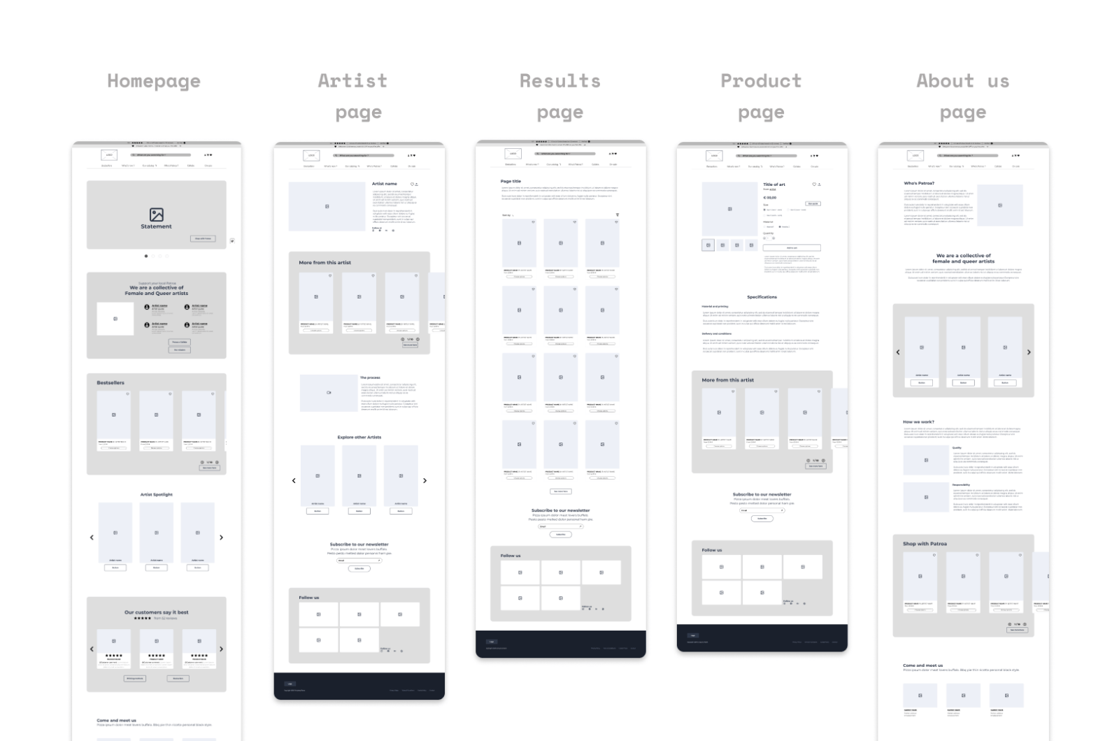
Mid-fidelity wireframes
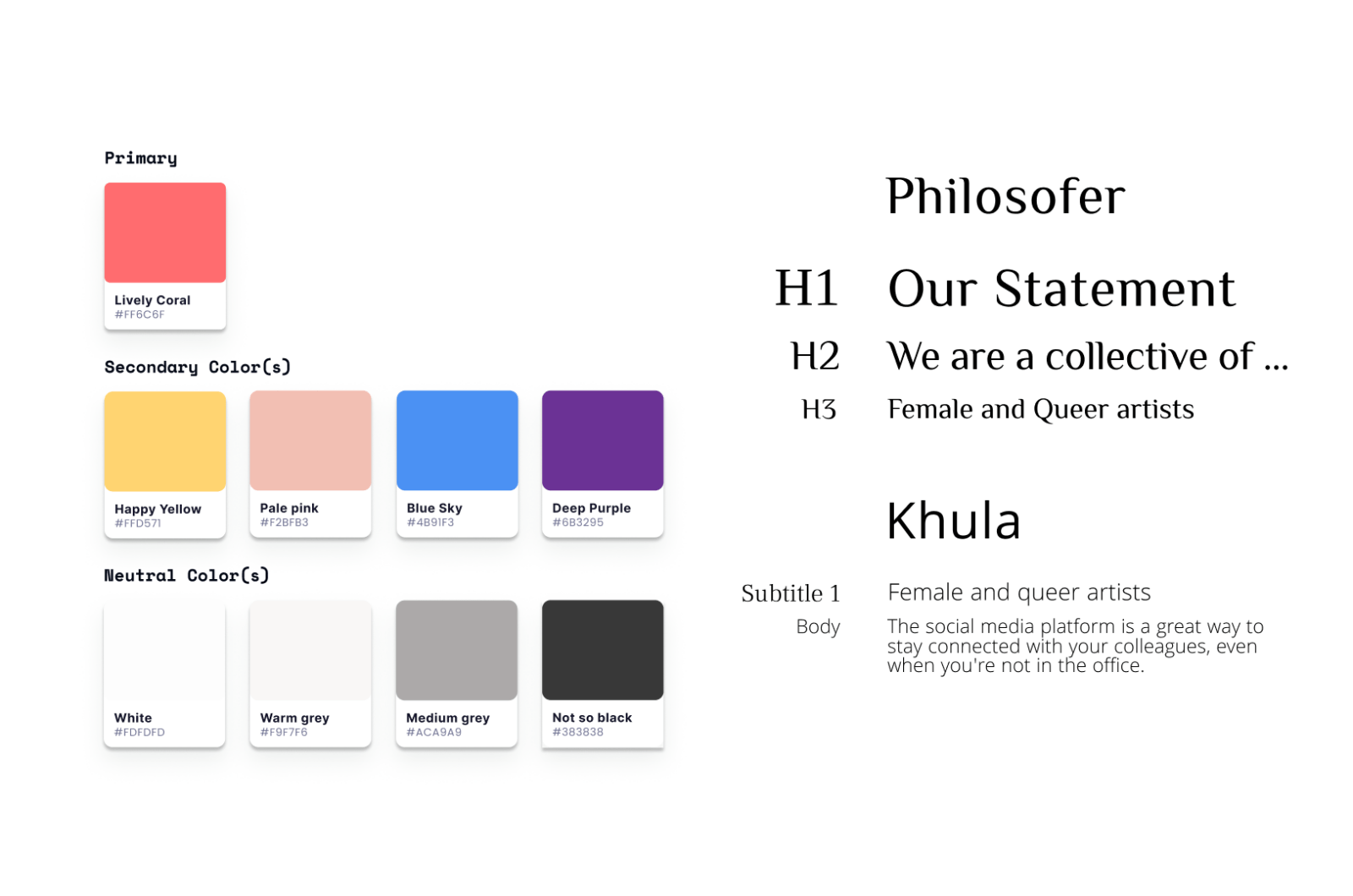
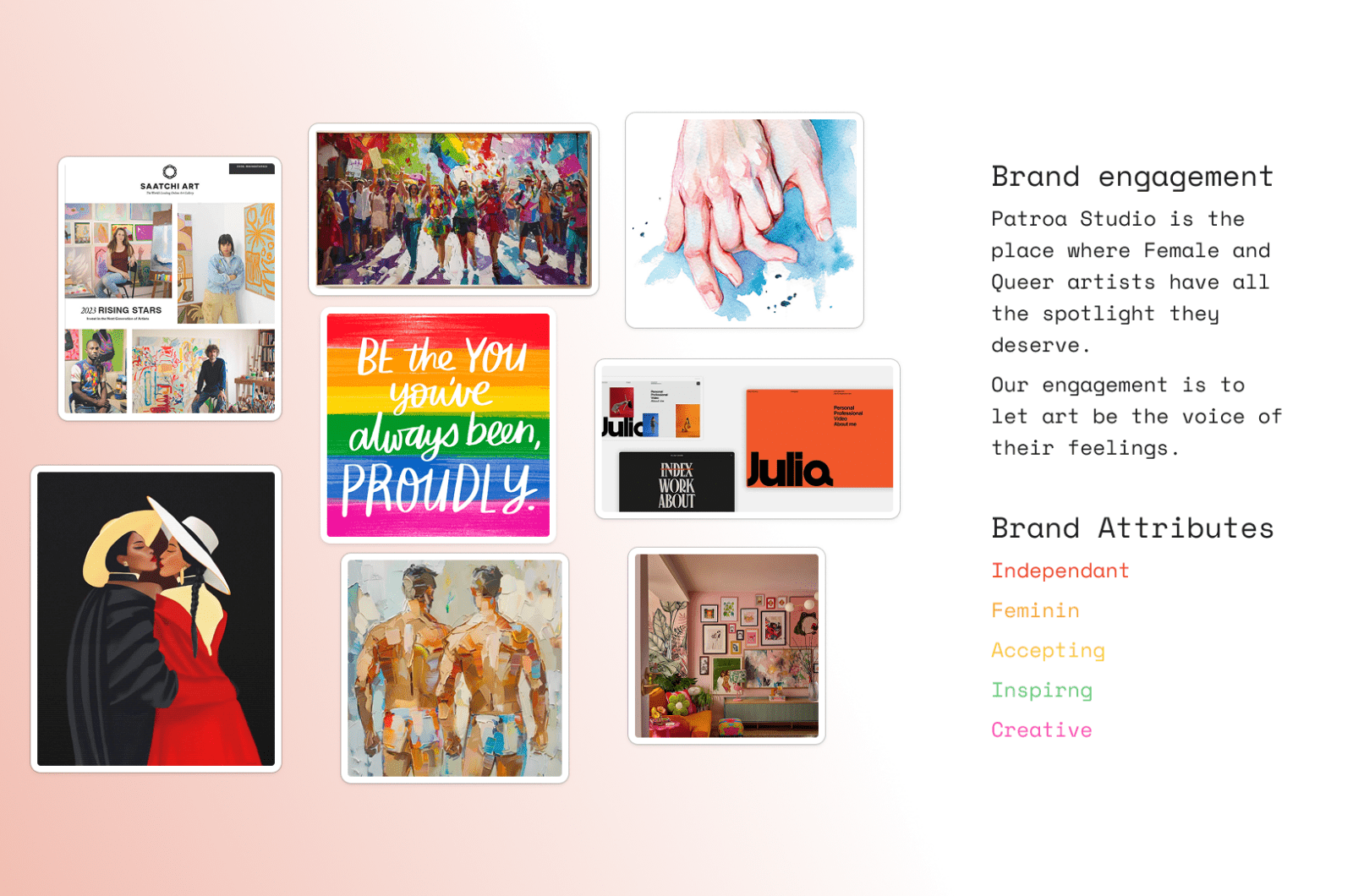
Brand Chart
Brand attributes
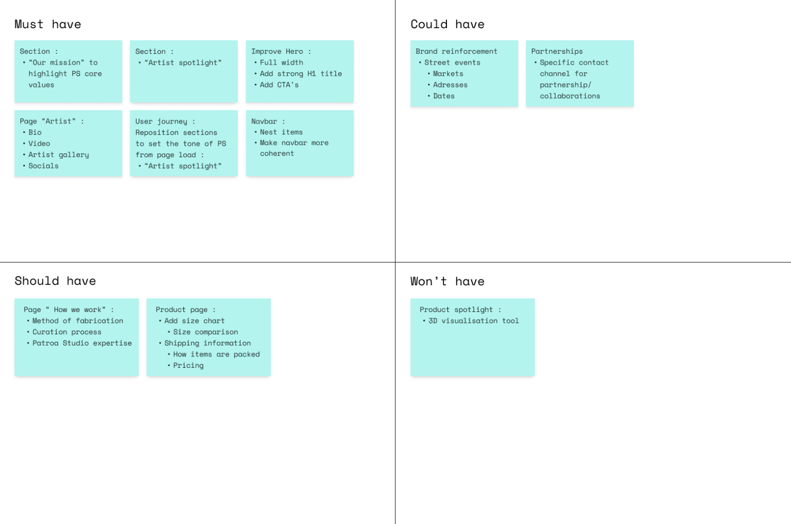
MoSCoW
UX Enhancements & Core Features
1. Information Architecture & Navigation
- Streamlined Navigation: Simplified the global navigation by nesting overlapping menus together, improving discoverability.
- Direct Artist Discovery: Integrated a dedicated artist slideshow, allowing users to navigate straight to the creators they appreciate.
- B2B Growth Channels: Added a dedicated contact channel tailored for future creative and community partnerships.
2. Homepage Experience & Storytelling
- Immersive Hero Section: Upgraded the static header to a full-width hero slideshow featuring targeted CTAs to immediately capture user intent.
- Early Mission Alignment: Positioned the “Engagement Section” directly below the hero area to establish the brand’s mission early in the user journey.
- Humanizing the Brand: Prominently featured the faces of collaborating artists within the engagement section to reinforce authenticity and value alignment.
- Optimized Visual Flow: Redesigned product galleries to showcase larger images while reducing the overall number of homepage galleries, eliminating visual fatigue and adding critical breathing space.
3. Product, Artist, & Brand Strategy
- Comprehensive Artist Profiles: Created dedicated artist pages featuring a short biography, behind-the-scenes “how they work” videos, and a consolidated catalog of their creations to build consumer trust.
- Reimagined Product Customization: Overhauled the product page interface to clearly display all framing, material, and sizing customization options.
- Elevated Brand Identity: Developed a vibrant new brand chart to transition the platform from a transactional storefront into an expressive artistic hub.
- Handcrafted Appeal: Redesigned the brand logo to convey a bespoke, handmade feel that reflects independent artistry.
Final product
Prototype
Reflection
Key Takeaways
The Challenge: Modern urban transit has evolved into a landscape of fragmented and complex commuting options.
The Necessity: To ensure punctuality and peace of mind, commuters now require more than schedules—they need real-time, adaptive navigation.
The UrbanSync Solution: We bridge the information gap by synthesizing hyper-personalized routing with crowdsourced intelligence.
The Impact: By providing high-fidelity data, we transform the user experience from transit-uncertainty to total navigational confidence.
Future Roadmap
Moving forward, our strategy centers on a continuous improvement loop. We will initiate rigorous usability testing to gather direct user insights, embracing a #FailFast philosophy to rapidly identify and resolve friction points. This iterative process will culminate in the design of high-fidelity prototypes, transitioning UrbanSync from a refined concept to a fully developed, market-ready solution for global urban mobility.